




A modern React implementation of the MIT SIMILE Timeline visualization component. Build beautiful, interactive timelines with ease.
Live Demo • Installation • Quick Start • API • GitHub
| Feature | Description |
|---|---|
| 100% Simile Compatible | Drop-in replacement for existing Simile Timeline JSON data |
| High Performance | 60+ FPS smooth scrolling with optimized rendering |
| Modern Stack | Built with React 18/19, TypeScript, and hooks |
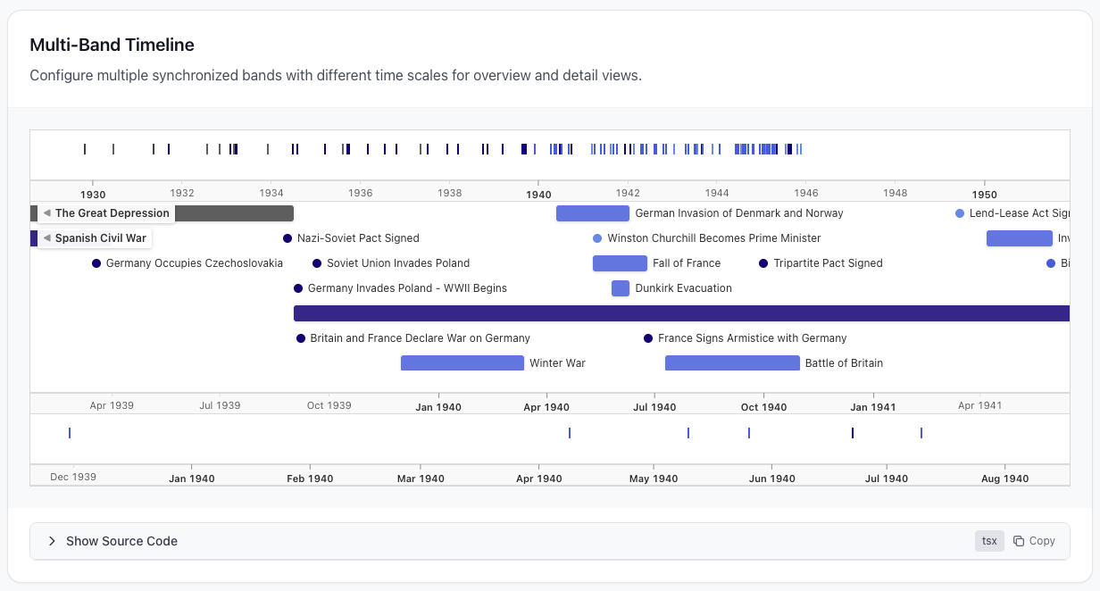
| Multi-Band | Two-band, three-band, or custom configurations |
| Fully Themeable | Classic, dark, and custom themes via CSS variables |
| WCAG 2.1 AA | Conformant — keyboard-operable, screen-reader semantics, AA contrast, reduced-motion aware. See ACCESSIBILITY.md |
| Lightweight | ~12KB gzipped in your bundle, zero runtime dependencies |
npm install react-simile-timelineyarn add react-simile-timelinepnpm add react-simile-timelineTwo different numbers, often confused:
| Measure | Size | What it is |
|---|---|---|
| Shipped to your users | ~12 KB gzipped | The ESM bundle (11.5 KB gzipped) plus the stylesheet (1.1 KB gzipped), after your bundler and your server's compression |
Installed in node_modules |
~404 KB | The whole published package on disk, including both builds, both type declarations, and sourcemaps |
Sourcemaps are 271 KB of that 404 KB. They are shipped deliberately, so you can step into library source when debugging, and they are never sent to a browser unless devtools asks for them. They do not reach your users and do not count against your bundle.
import { Timeline } from 'react-simile-timeline';
import 'react-simile-timeline/style.css';

function App() {
  const data = {
    dateTimeFormat: 'iso8601',
    events: [
      { start: '2024-01-15', title: 'Project Started', color: '#4a90d9' },
      { start: '2024-03-01', end: '2024-06-30', title: 'Development', isDuration: true, color: '#6b8e5f' },
      { start: '2024-07-01', title: 'Launch Day', color: '#c41e3a' },
    ],
  };

  return <Timeline data={data} height={400} />;
}<Timeline
dataUrl="/api/events.json"
height={400}
onEventClick={(event) => console.log(event)}
/><Timeline
data={data}
hotZones={[
{
start: '2024-03-01',
end: '2024-06-30',
color: 'rgba(107, 142, 95, 0.15)',
annotation: 'Development Sprint',
},
]}
height={400}
/><Timeline
data={data}
bands={[
{ id: 'main', height: '70%', timeUnit: 'month', intervalPixels: 100 },
{ id: 'overview', height: '30%', timeUnit: 'year', overview: true, syncWith: 'main' },
]}
height={400}
/><Timeline data={data} theme="dark" height={400} /><Timeline
data={data}
theme={{
name: 'ocean',
backgroundColor: '#0f172a',
eventColor: '#38bdf8',
eventTextColor: '#e2e8f0',
scaleColor: '#94a3b8',
gridColor: '#334155',
}}
height={400}
/>| Prop | Type | Default | Description |
|---|---|---|---|
data |
TimelineData |
- | Inline timeline data |
dataUrl |
string |
- | URL to fetch timeline JSON |
dataUrls |
string[] |
- | Multiple URLs to fetch and merge |
bands |
BandConfig[] |
Auto | Band configuration array |
hotZones |
HotZone[] |
[] |
Highlighted time periods |
theme |
'classic' | 'dark' | Theme |
'classic' |
Theme configuration |
centerDate |
string | Date |
Median | Initial center date |
width |
string | number |
'100%' |
Container width |
height |
string | number |
400 |
Container height |
onEventClick |
(event) => void |
- | Event click callback |
onEventHover |
(event) => void |
- | Event hover callback |
branding |
boolean | BrandingConfig |
- | Show watermark |
className |
string |
- | Container CSS class |
| Property | Type | Required | Description |
|---|---|---|---|
start |
string |
Yes | Start date (ISO 8601) |
title |
string |
Yes | Display title |
end |
string |
No | End date for duration events |
description |
string |
No | Shown in popup |
isDuration |
boolean |
No | Force duration rendering |
color |
string |
No | Background color |
textColor |
string |
No | Label text color |
icon |
string |
No | URL to custom icon |
image |
string |
No | URL to event image |
link |
string |
No | URL for "more info" |
interface TimelineData {
  dateTimeFormat?: 'iso8601' | 'Gregorian' | string;
  events: TimelineEvent[];
}

interface BandConfig {
  id?: string;
  height?: string;
  timeUnit?: 'day' | 'week' | 'month' | 'year' | 'decade' | 'century';
  intervalPixels?: number;
  overview?: boolean;
  syncWith?: string;
}

interface HotZone {
  start: string;
  end: string;
  color?: string;
  annotation?: string;
}

interface Theme {
  name: string;
  backgroundColor?: string;
  eventColor?: string;
  eventTextColor?: string;
  scaleColor?: string;
  gridColor?: string;
}The timeline is fully operable by keyboard. Tab moves through the interactive
elements in reading order: the timeline band first (a single tab stop for
pan/zoom), then each event marker. The pan and zoom shortcuts only act while the
timeline band or one of its markers holds focus, so an embedded timeline never
hijacks the page's arrow keys.
| Key | Focus | Action |
|---|---|---|
Tab / Shift+Tab |
anywhere | Move to the next / previous element (timeline band, then markers) |
← / → |
timeline focused | Pan left / right |
+ / = |
timeline focused | Zoom in |
- |
timeline focused | Zoom out |
Enter / Space |
marker focused | Open the event popup |
Tab |
popup open | Cycle focus within the popup (focus is trapped) |
Escape |
popup open | Close the popup and return focus to the marker |
When a popup opens, focus moves into the dialog and is trapped there until it
closes; closing it (via Escape or the close button) restores focus to the
marker that opened it.
Focusable elements show a visible focus ring when reached by keyboard. Its
colour is the themeable --focus-ring-color CSS variable (classic #1a73e8,
dark #8ab4f8); override it in a custom theme to keep the ring at least 3:1
against your background.
The library honours prefers-reduced-motion. When a visitor has reduced motion
enabled at the OS level, the event and popup fade-ins and the theme-change
transitions are removed, and a pan stops immediately on release instead of
gliding with momentum.
The component conforms to WCAG 2.1 Level AA. The
accessibility conformance statement documents the criteria
met, how each was verified (an axe-core gate in CI, keyboard and
accessibility-tree end-to-end tests, and a contrast audit), and the consumer's
responsibilities for custom themes and event-description HTML.
This library is 100% compatible with the original Simile Timeline JSON format:
{
  "dateTimeFormat": "iso8601",
  "events": [
    {
      "start": "1963-11-22",
      "title": "JFK Assassination",
      "description": "President Kennedy assassinated in Dallas, Texas.",
      "color": "#c41e3a"
    }
  ]
}
Supported date formats:
- ISO 8601:
2023-01-15,2023-01-15T10:30:00 - Legacy:
Jan 15 2023,January 15, 2023 - Year only:
2023,-500(BCE)
| Browser | Support |
|---|---|
| Chrome | Latest |
| Firefox | Latest |
| Safari | Latest |
| Edge | Latest |
Contributions are welcome! Please read our Contributing Guide for details.
MIT License - see LICENSE for details.
Made with React • TypeScript • MIT SIMILE Timeline